COMIC BOOK REVIEW:
Moriarty #7
Writer: Daniel Corey
Artists: Mike Vosburg (pages 2 - 21) & Anthony Diecidue (pages 1, 22)
Publisher: Image Comics
Reviewer: Andrew Rubio
Review Date: December 16, 2011
Rating: 8 out of 10
Back in Junior High, I was quite the Sherlock Holmes fan. I had read all the Arthur Conan Doyle stories; picked up a plethora of stories and novels written by others (some of my favorites include "The Holmes-Dracula File" by Fred Saberhagen and "The Seven-Per-Cent Solution" by director Nicholas Meyer); and watched tons of Holmes movies and television series (including the Granada Television version staring the amazing Jeremy Brett). It's easy to admit that I was a Holmes junkie. As time passed however, I found myself drifting away from the character and spending more time with another British import (Doctor Who). The older I get, the less I remember of the stories I read as a teenager. Such is life.
As I started reading Moriarty #7, I was immediately taken back to my youth. Writer Daniel Corey has a real grasp on what a young Moriarty should sound and act like - Brash, intelligent and dangerous. He's at least three to four steps ahead of you before you even enter the room.
We join the story at Chapter 3 of The Lazarus Tree story arc. It's a perfect jumping on point for a new reader, as the entire issue is a flashback to the young professor's life. In the flashback, Moriarty is already well on his way to becoming the "Napoleon of Crime." The Professor attempts to employee a young student to take over the operation of his Bombay office. When the student refuses because of an obligation to his father, Moriarty begins a ruthless operation that will eventually change the student's mind.
The way Corey writes each scene is perfection. Moriarty's character is impertinent and despite the odds against him, he remains in control of the situation. It was a joy to read as the plot played out to the bitter end.
How the flashback plays against the current story arc isn't covered in this issue outside of the student's involvement. I'm sure there are more details in the previous issues.
In the art department, Mike Vosburg takes on the bulk of the chores. His art fits the story well and captures the flair of the time period. The crucial finale is layered perfectly and the panels flow without a loss in story. His style is a mesh between Eduardo Barreto (who unfortunately just died) and Tim Truman.
Anthony Diecidue's opening and closing pages are a bit rougher but also fit the "present" setting of the story. It's only two pages so it's hard to mention anything else.
I have to say I really enjoyed this issue. I'm tempted to add this title to my Pull List and track down the previous 6 issues or the Trade Edition. You probably should too if you like Holmes and the characters in his universe. Professor Moriarty is treated with the respect a villain of his caliber should be treated.
Pick it up!
(This Review was originally posted on Impulse Gamer)
Copyright © 2011 by Andrew Rubio
Showing posts with label Image. Show all posts
Showing posts with label Image. Show all posts
Friday, December 16, 2011
Friday, September 30, 2011
PULLED FROM THE BACKLOG: Marineman #1
Previously on Pulled From The Backlog:
From 2009 to 2011, my job had me traveling across the globe. I found myself traveling from California to St. Louis. From St. Louis to Singapore. From Singapore to Macau and Hong Kong. During that time, I had my LCS in California (DJ's Universal Comics) keep my pull list active. Now back home and readjusting to American life - I find myself facing 3 long boxes FILLED with over two years worth of comics!
Brightest Day and Siege are still new to me. Dark Horse has just released Doctor Solar, Man of the Atom. The Image founders are teaming up to bring out Image United. Now several storylines behind the rest of the world… I pull an issue from the backlog.
Marineman #1
Writer: Ian Churchill
Artist: Ian Churchill
Publisher: Image Comics
Release Date: December 2010
Reviewer: Andrew Rubio
Review Date: September 30, 2011
Rating: 3 out of 5
Having read through this week's New 52, I decided to pull something from my two year backlog. I was looking for a quick read. A One Shot maybe. Nothing too complex after having read George Pérez's Superman #1. Wow! That book was dense! After I was done, it felt like I had read a graphic novel.
 |
| Packed with words and pictures! |
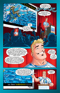
First off I gotta say this is one wordy book! I thought Superman #1 was dense. Marineman #1 gives any Bendis title a run for its money in the word department.
 |
| Wordy! |
 |
| More Wordy! |
 |
| Definition of Wordy: Relating to or consisting of words; verbal. |
It really feels like Churchill was trying to teach more than entertain. I definitely know more about Oceanography now than I did earlier this morning. I'll admit I zoned out more than once while reading the issue. This was not the breezy reading I was looking for.
The art on the other hand is very pleasing. Churchill has a good, clean style and a lot of his layouts are very dynamic. His art literally pops off the page.
 |
| No problems here. |
If you're a fan of Churchill's art - By all means pick it up. Or at this point, pick up the Trade.
Copyright © 2011 by Andrew Rubio
Subscribe to:
Posts (Atom)

